


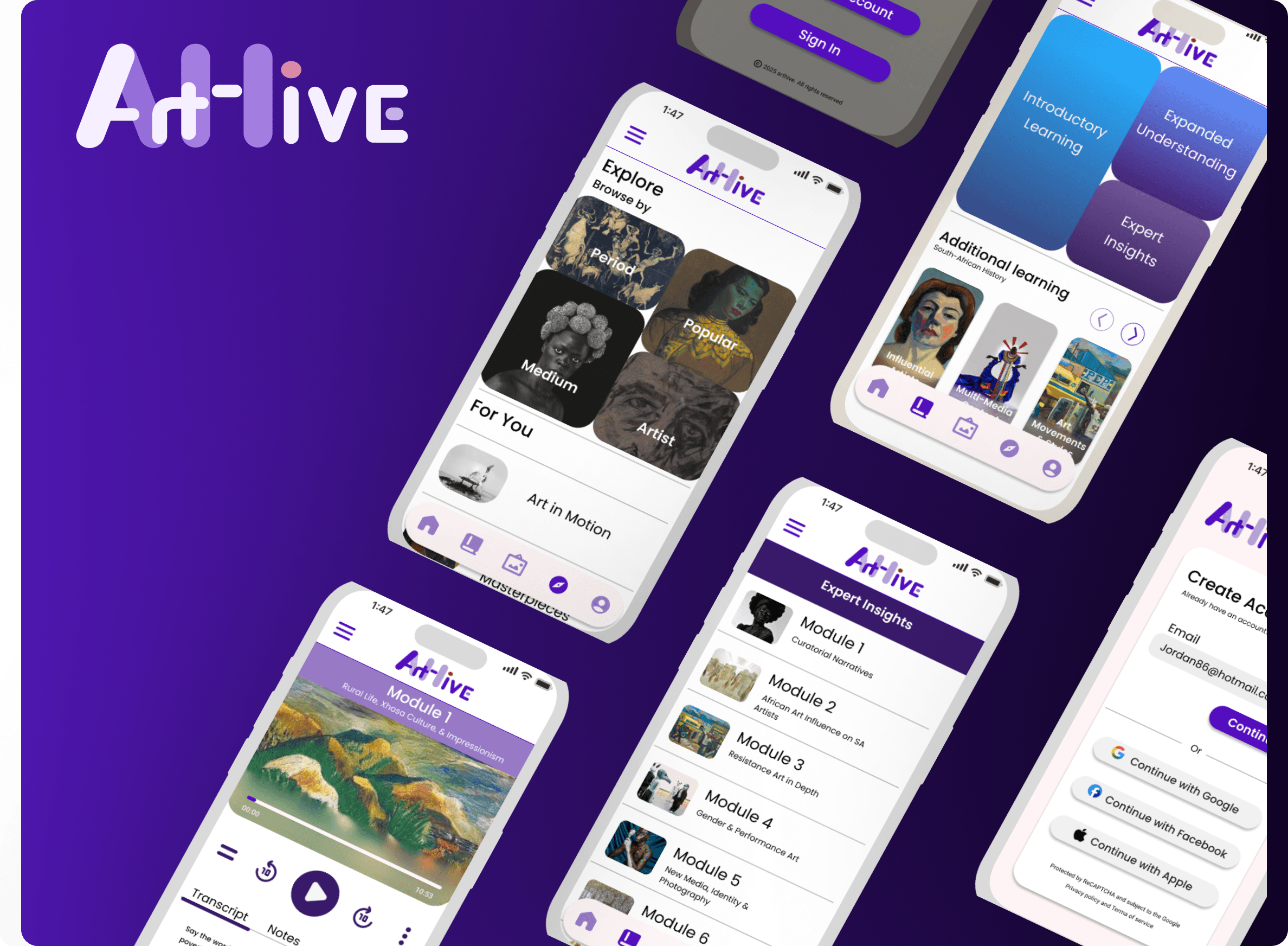
Problem
Users felt alienated from art history because the interface and learning structure was overwhelming, confusing, acedemic and mundane.
Goal was to revolutionize learning inherintly boring content and promote active user engagement by:
Onboarding satisfaction score:
85%
Business Goal and KPI's
Business Goals
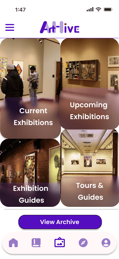
Increase engagement with art history content
Drive real-world exhibition attendance
Support cultural institutions with audience growth
Measurable success metrics
Onboarding satisfaction -qualitative feedback
Higher engagement: longer session length and repeat visits
Increased exhibition interest and curiosity
Partnerships with museums and cultural programs
Design Strategy
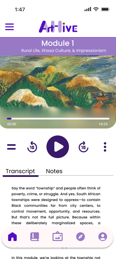
After all the feedback and insights, my strategy was to Reduce Intimidation accociated with learning- which in turn translated to High bounce rate

Design Outcome
Because ArtHive was relatively early stage, success was evaluated through directional validation rather than hard analytics.
The focus was on answering the following three questions:
Do users feel less
intimidated when entering
the platform?
Does the learning flow feel
structured rather than
acedemic or overwhelming?
Can they understand
where to start without
explanation?
These signals indicated the design was reducing cognitive friction, associated with bounce rate which was the core goal.
These signals indicated the design was reducing cognitive friction, associated with bounce rate which was the core goal.
Constraints
Because quantitative data was limited, I had to rely on:
-Secondary research
-Pattern-finding rather than assumptions
This Included: