My Role:

UI / UX Designer

Key Performance Indicators:

S.E.O Performance +32%

My Role:

UI / UX Designer

Key Performance Indicators:

S.E.O Performance +32%

About

Contact

Overview

Zephy was an e-commerce platform focusing on Home Improvement/ DIY.

I redesigned the end-to-end shopping journey, from landing page to checkout, to improve organic traffic, conversion and brand credibility.

Significant

drop-off at

Add to Cart

High volume of

abandoned

checkouts

Users reached

decision points,

then hesitated

Problem

Zephy’s challenge wasn’t only getting more traffic, but rather what happened after users showed intent.

For a high-ticket store, this signaled that:

Users were interested , but not confident enough to commit..


Analysis revealed:

Hypothisis

The goal was clear- reduce perceived risk, and not just optimize flow.

This meant that If users hesitate at Add-to-Cart and Checkout, the interface is failing to answer unspoken risk questions that normally sounds like:

Can users trust this store?

Will delivery and returns

be painless?

What happens if

something goes wrong?

Constraints

  • Early-stage brand with little established trust

  • Limited marketing budget which means more reliance on organic traffic

  • High-ticket products requiring careful consideration

  • Shopify constraints on checkout customization

These constraints meant that the UX had to carry more responsibility, while ensuring business objectives are still met

Objectives where to:

Reduce Bounce Rate

Reduce Checkout Abandonment

Improve S.E.O Performance

Increase Conversion Rate

Reduce Bounce Rate

Reduce Checkout Abandonment

Improve S.E.O Performance

Increase Conversion Rate

Research

Because of the constraints- for research- I decided to focus more on behavioral signals which included:


  • Abandonment patterns at Add-to-Cart and Checkout

  • Review of product page clarity and trust indicators

  • Competitive analysis of high-ticket e-commerce patterns


This research showed that Users knew well what they wanted to buy, but they were unsure about the risk of buying.


Decision 2 - Reduce psychological friction at Checkout


This included:

  • Reducing surprise costs and unclear steps

  • Making security, payment, and delivery reassurance clear

  • Simplifying checkout hierarchy

Decision 1 - Strengthen pre-commitment reassurance (before Add-to-Cart)

  • Clarified warranties and return policies before users committed

  • Reinforced shipping and fulfillment transparency

  • Reduced ambiguity around post-purchase support

  • These changes allowed customer objections to be handled before they surfaced.

  • Reduced ambiguity around post-purchase support

UX Strategy

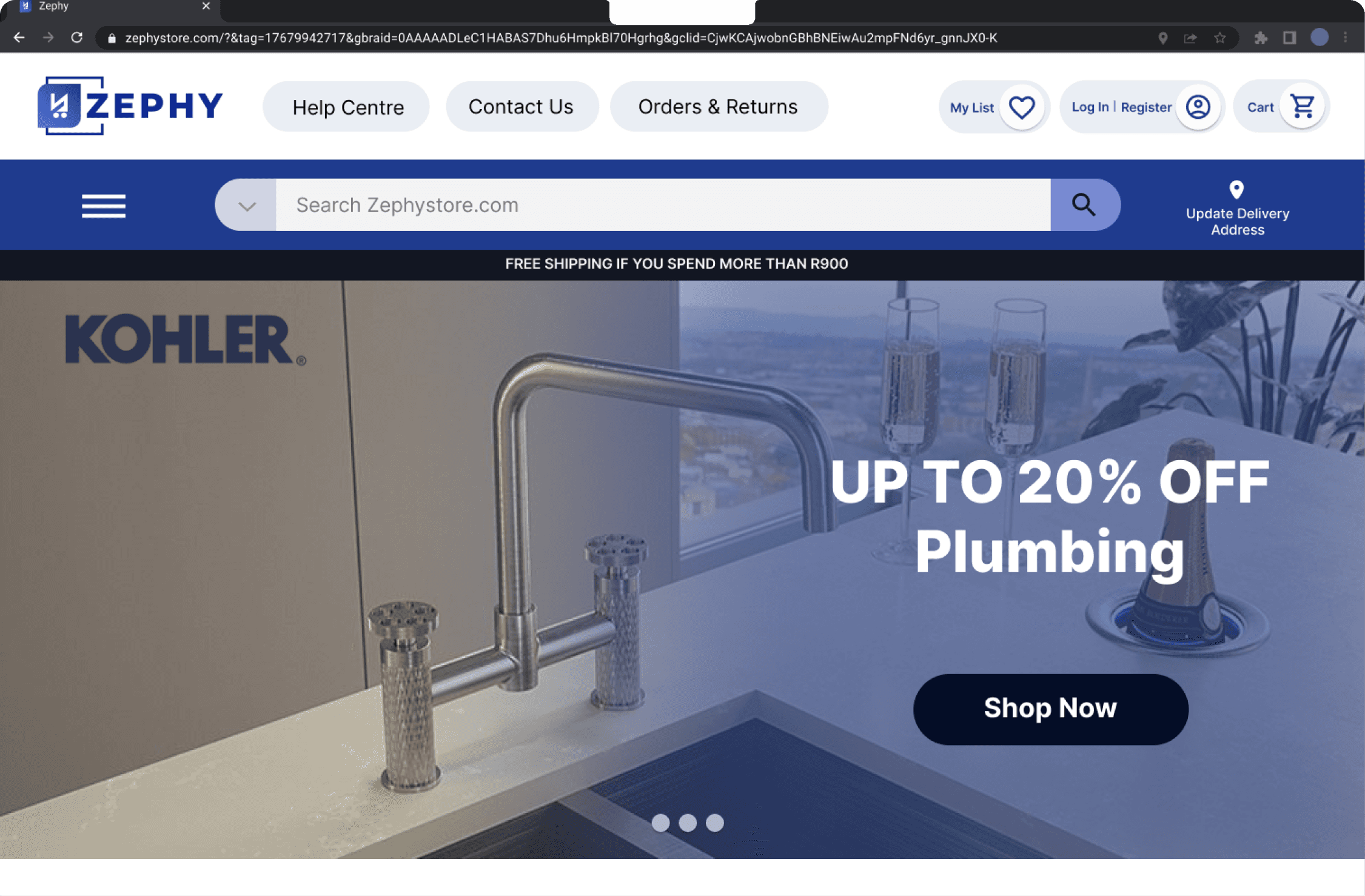
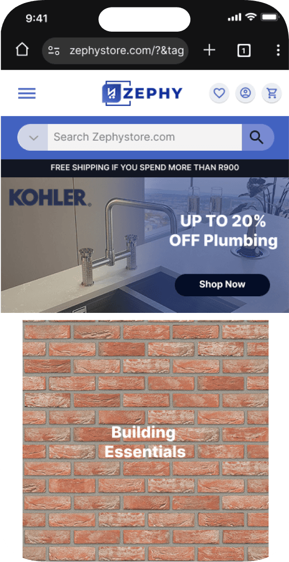
  • The original website was built mobile-first , following a common best practice for e-commerce design.


Decision 4 - Desktop First Mobile Later


We shifted to a desktop-first design strategy prioritized clarity, trust, and product education - All of which benefit from the spatial flexibility of a desktop canvas.


Key shifts included:


Key shifts included:


Expanded content hierarchy:


Room for detailed specs, warranty info, and comparisons without overwhelming users.

Enhanced trust cues:


Clear visibility of payment options, shipping guarantees, and secure checkout messaging.

Professional-grade layouts:


Ideal for Zephy’s B2B audience (contractors, electricians, builders) who shop via laptops or workstations.

Progressive enhancement for mobile:


Mobile layouts were simplified versions of the desktop experience — still fast, still clean, but intentionally leaner for on-the-go product lookups rather than full purchase flow.

Impact

Apart from the key business goal at the time which was customer aquisition and the business metrics that goes along with it (improving conversion rate and S.E.O, while lowering bonce rate), several directional signals were observed during iteration. This included, improved engagement on product pages with clearer reassurance, reduced confusion around fulfillment and returns, lastly reviews indicated stronger perceived trustworthiness of the overall user experience.


Conversions (Relative)

Bounce Rate

+20%

-35%

+32%

S.E.O Performance

Conversions (Relative)

Bounce Rate

+20%

-35%

+32%

S.E.O Performance


When the stakeholders of Zephy saw what might seem like small changes in the user experience and the impact it had on the growth of the business in such short period of time, to say they were happy would be an understatement. As a result they were also able to further raise capital and be more aggresive in some desicion making regarding the growth of the business.

Unfortunately after 10 months after finishing my contract with the company, the business were sold and name was changed which the stakeholders couldn't disclose. This was unfortunate, since I enjoyed working with everyone and seeing how the company was able to make such big strides in a short period of time.


View Rest of Project

View Rest of Project

Let’s Talk

Zephy

Zephy

Stakeholder Alignment

The primary stakeholders were the business owner and marketing lead, where the focus was on customer acquisition and revenue growth under tight budget and development constraints.

Core tension
The business needed users to convert faster, while customers needed stronger reassurance before committing to high-ticket purchases.


Learnings
When I first presented my design decisions to the stakeholders, It was important for me to showcase my design process- including various screens and flows. This wasn't nessearily wrong, however the business outcomes as a result, were not clear.


My Approach

I presented changes in terms of risk reduction rather than visual improvement, then framed it around specific abandonment points (Add to Cart and Checkout). After this small adjustment discussions were then focused more on business impact and prevented over-designing under constraints.


Handoff strategy
I handed off the designs with clear intent annotations, prioritization notes, and made sure assumptions were documented to support phased implementation and avoid rework.


Anticipated challenges
Given Shopify checkout limitations and limited developer availability, solutions were scoped to be modular, low-risk, and easily reversible.


Grethan Pienaar 2026 | Designer | grethanpienaar@gmail.com

Grethan Pienaar 2026 | Designer | grethanpienaar@gmail.com