

Zephy
My Role:
UI / UX Designer
Key Performance Indicators:
S.E.O Performance +32%


Zephy is an e-commerce platform focusing on Home Improvement/ DIY.
I redesigned the end-to-end shopping journey, from landing page to checkout, to improve conversion, clarity, and brand credibility.
Business Impact
Higher conversion confidence: Desktop users — responsible for the bulk of high-value orders — now experience a tailored, frictionless buying process.
Reduced cart abandonment (−25%) due to visible trust elements and clearer pricing transparency.
Improved brand perception: The interface now conveys the same level of reliability and professionalism as the products Zephy sells.
We shifted to a desktop-first design strategy prioritized clarity, trust, and product education - All of which benefit from the spatial flexibility of a desktop canvas.
Key shifts included:
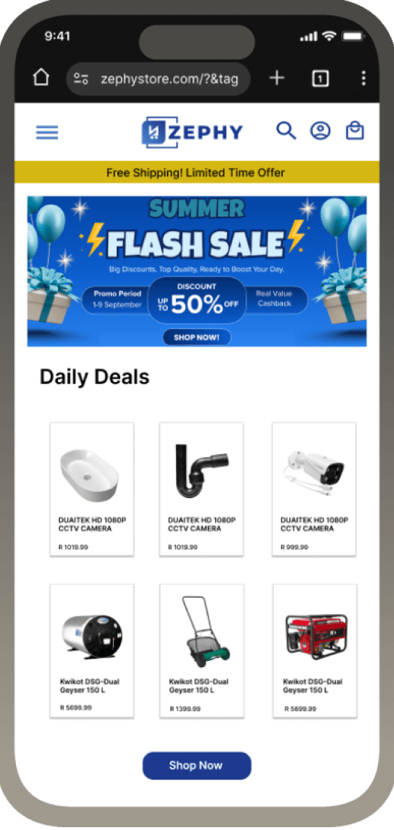
The original website was built mobile-first , following a common best practice for
e-commerce design.
The mobile layout limited how much product detail, comparison data, and trust-building content could be presented effectively.
Users browsing on mobile devices often dropped off before completing a purchase, and desktop users - who made up the majority of high-value transactions - were left with an under-optimized experience.
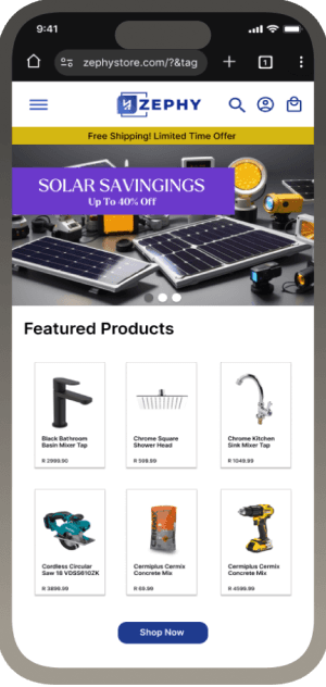
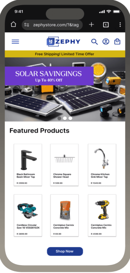
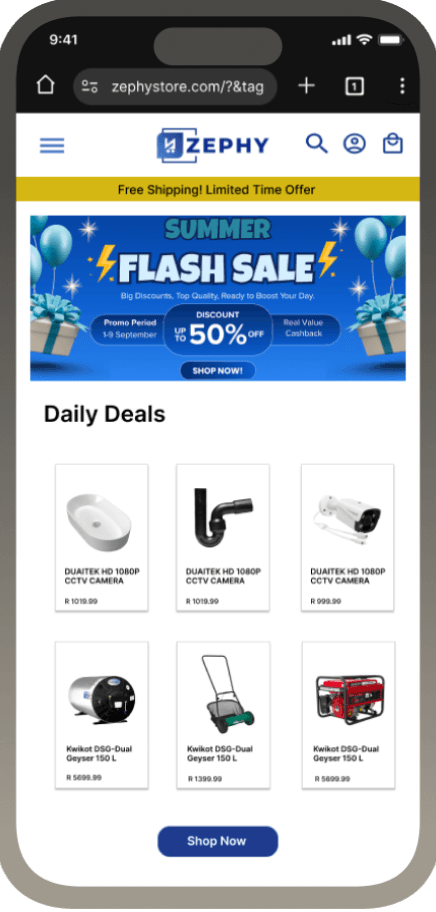
Generic layout - No brand story - High bounce rate
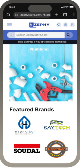
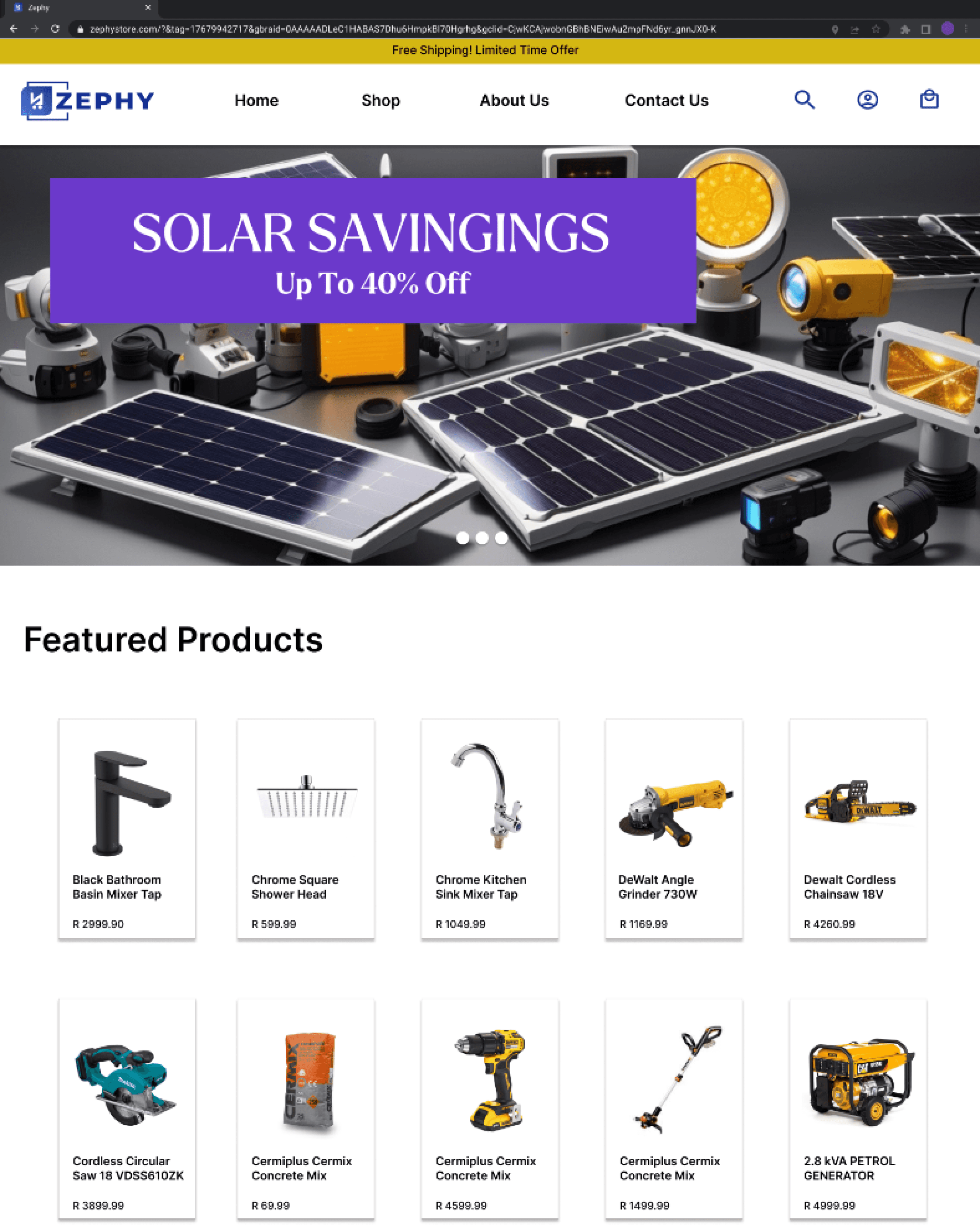
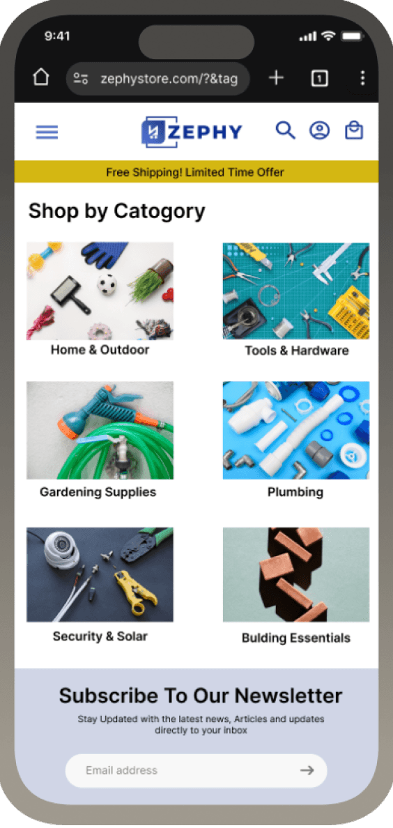
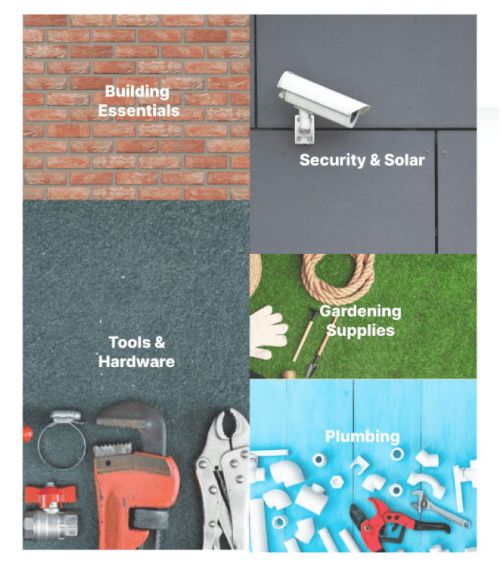
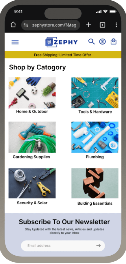
Curated navigation tiles,
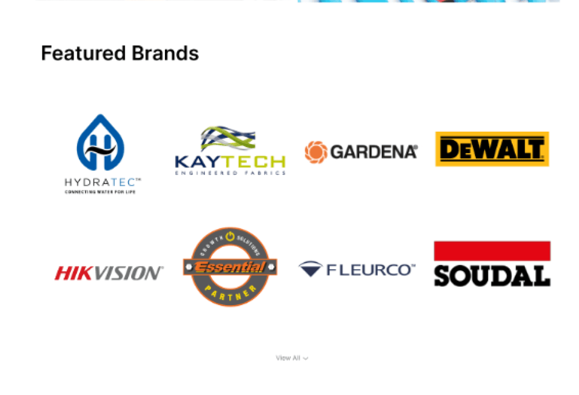
Trusted Brands, Consistent spacing.
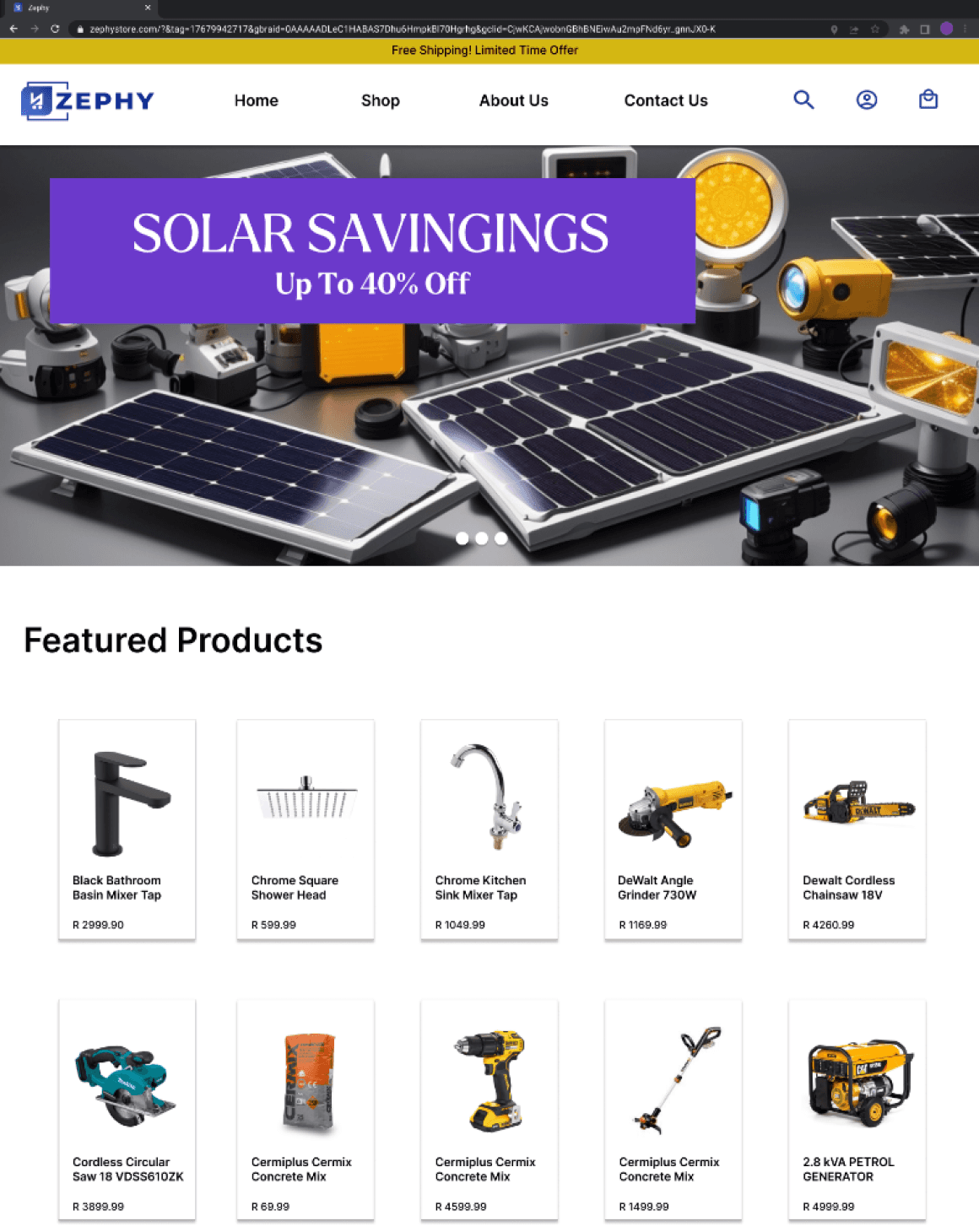
Before
Before
Before
Impact
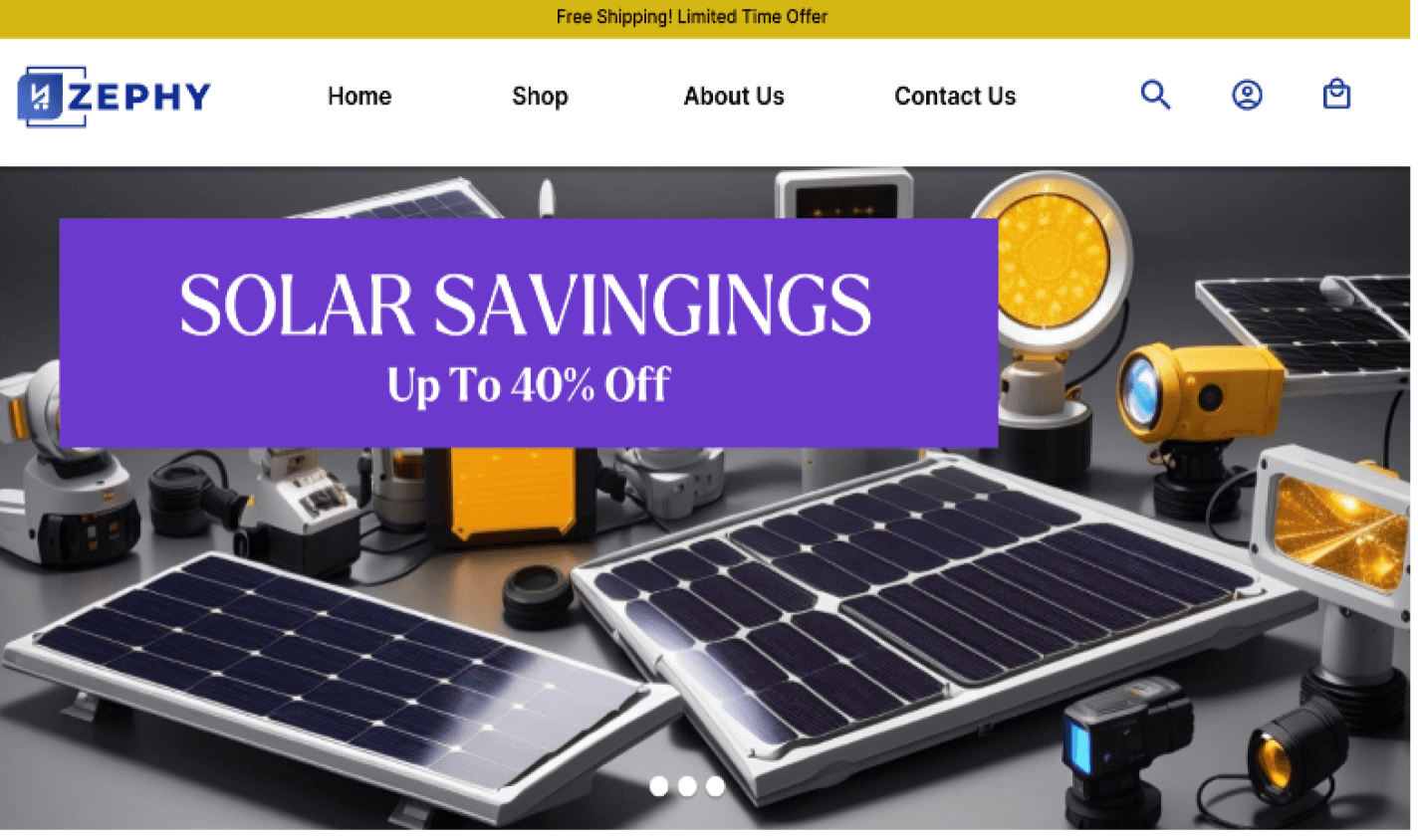
After
After
After
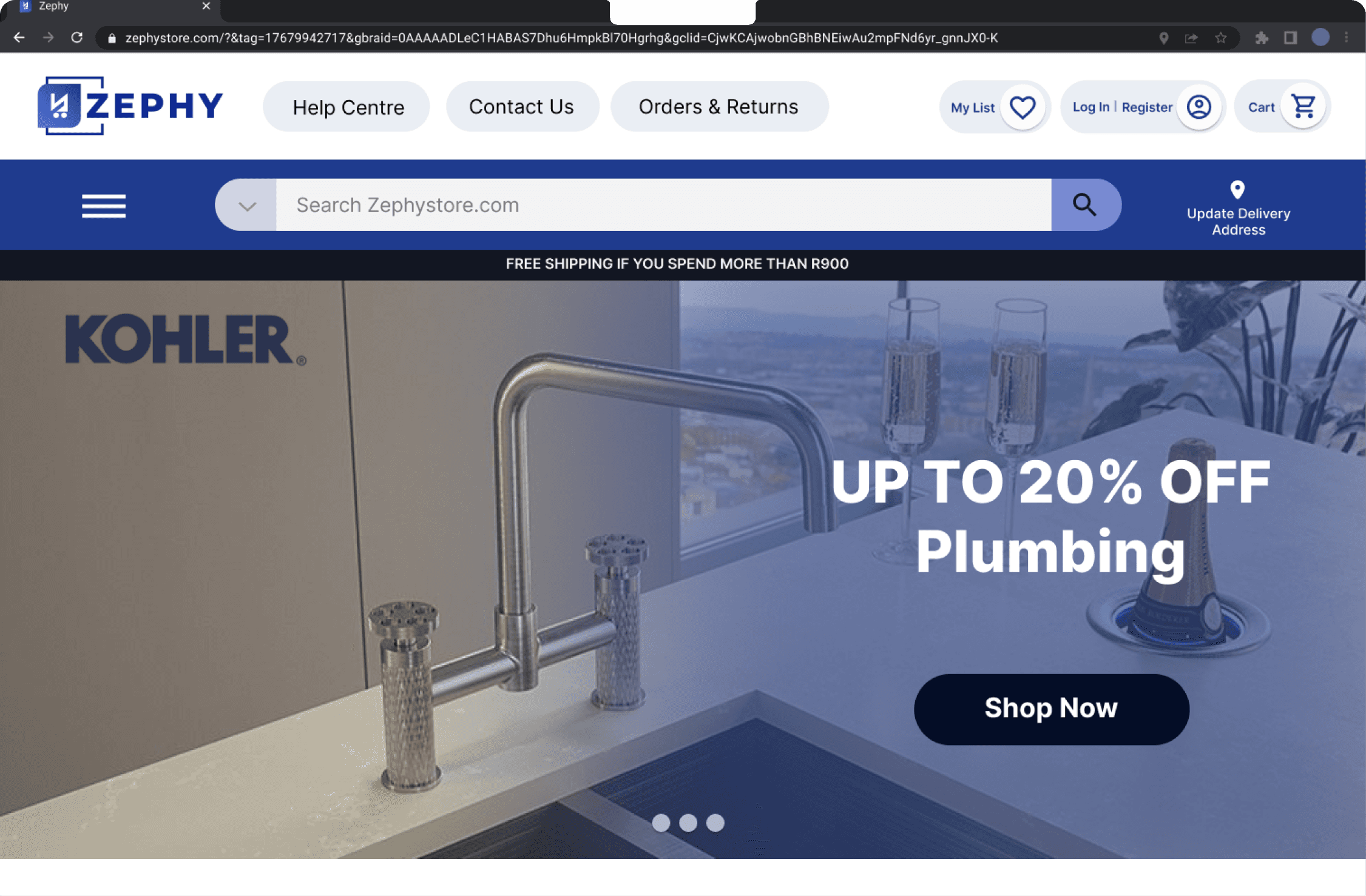
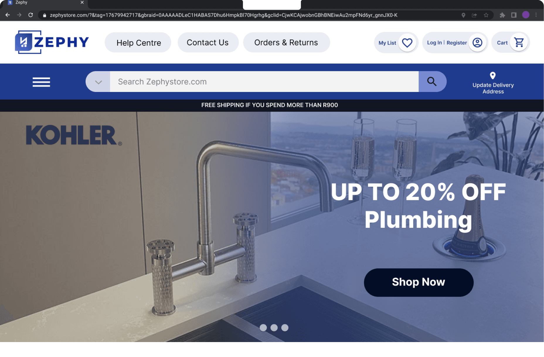
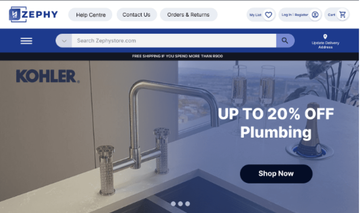
Simplified hero with Cleaner Layout- designed for Accessibility
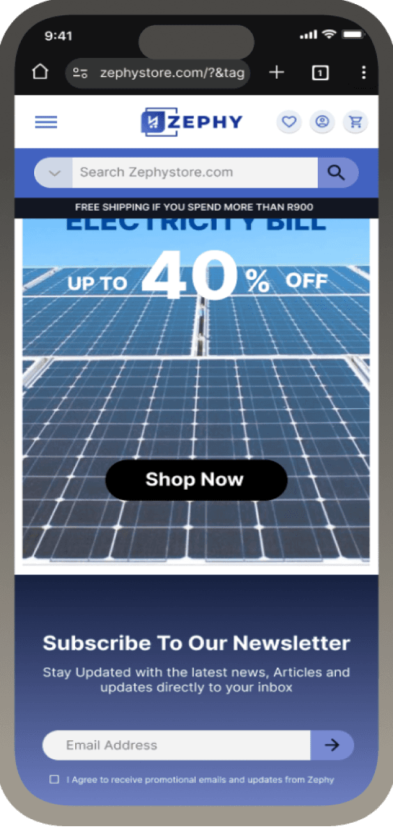
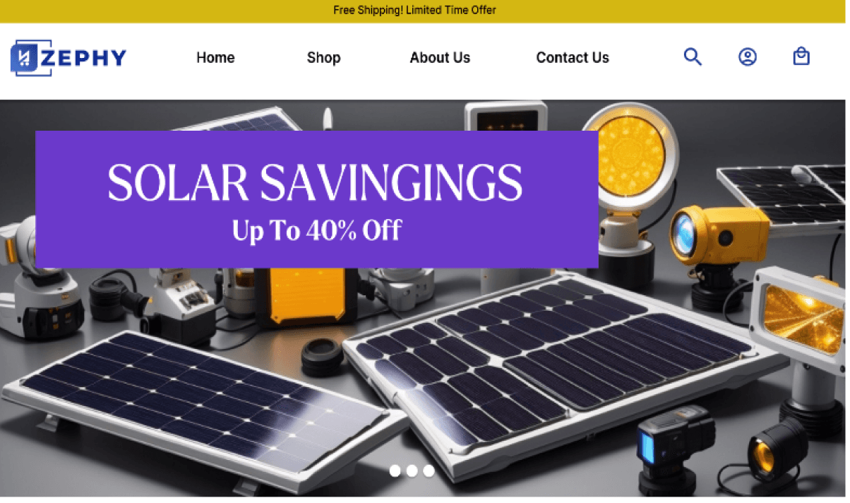
Original template design - Cluttered, Generic, Conversion-Poor.
Business Objectives
Problem- Solution- Impact
From Generic Listings to Value-Driven Product Experience
Simplifying the Path to Purchase
Quantifiable Outcomes
Understanding the Problem
Desktop First- Mobile Later


Conversions
Bounce Rate
+20%
-35%
+32%
S.E.O Performance

Template design providing little to no- Trust Signals
Visible Improvement in (trust badges, delivery info, CTA area, and more structured reviews)
Flat, transactional tone:
The page felt mechanical — not human or brand-driven — which led to hesitation in completing purchases above R5,000+.
Trust and transparency cues:
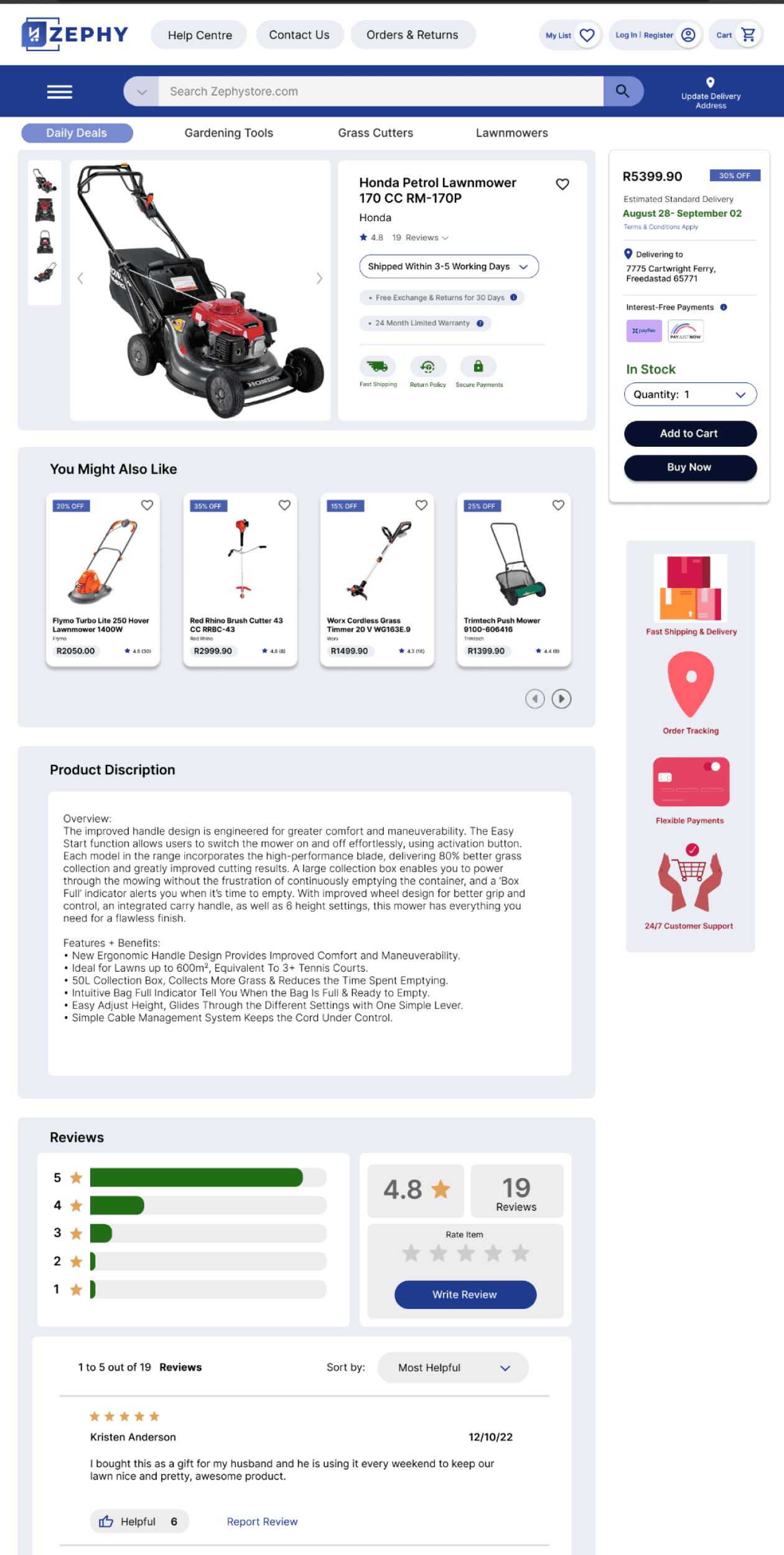
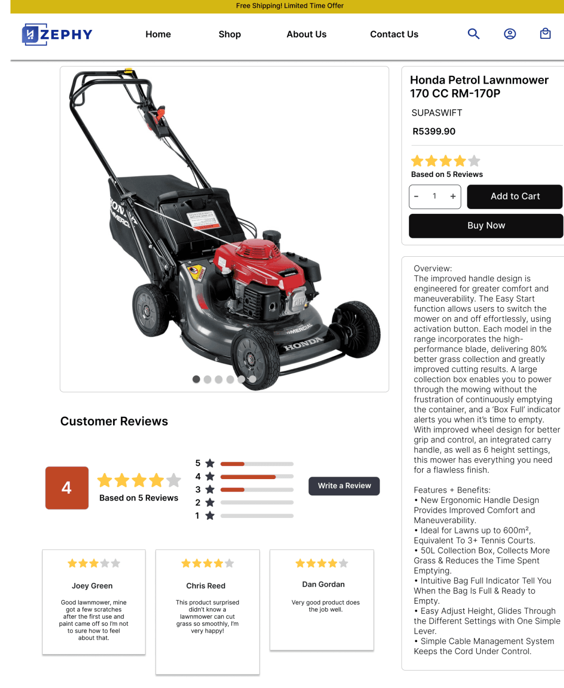
Clear delivery estimates (“5 Days From Today”), visible total price, and payment badges near the “Pay Now” button.
Expanded content hierarchy:
Room for detailed specs, warranty info, and comparisons without overwhelming users.
Enhanced trust cues:
Clear visibility of payment options, shipping guarantees, and secure checkout messaging.
Professional-grade layouts:
Ideal for Zephy’s B2B audience (contractors, electricians, builders) who shop via laptops or workstations.
Progressive enhancement for mobile:
Mobile layouts were simplified versions of the desktop experience — still fast, still clean, but intentionally leaner for on-the-go product lookups rather than full purchase flow.


KPI
Before
Conversion Rate
1,8 %
41
70 %
14 %
73
40 %
22%
3,2%
+ 77%
+ 32%
-40 %
+ 16%
S.E.O Score
Cart Abandonment
Returning Customers
After
Delta
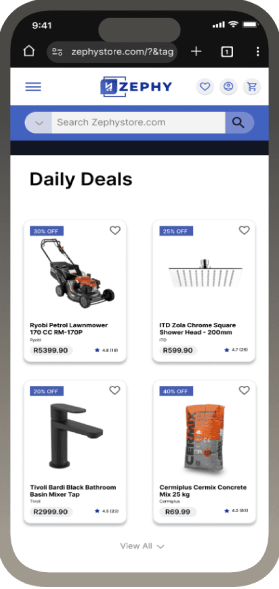
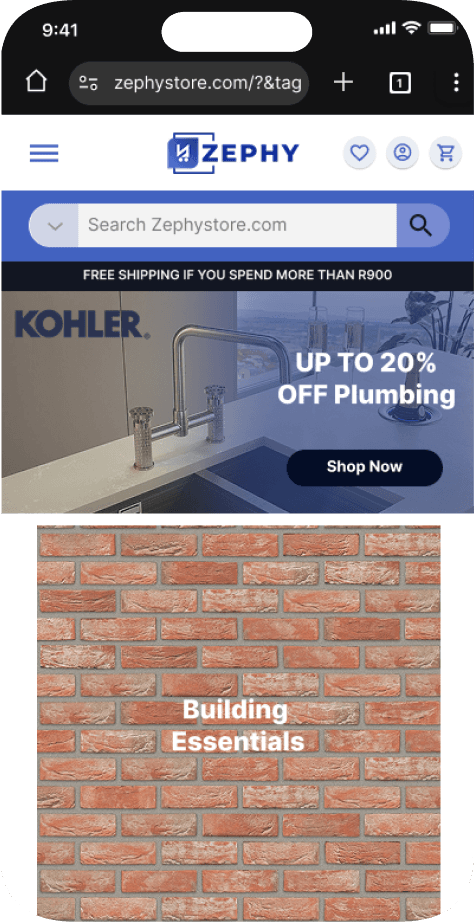
Improved Mobile experience:
Simplified- Clear- Fast- Clean
Lack of trust-building visuals:
No security cues, delivery timelines, or policy reassurance near critical actions.
Progressive clarity:
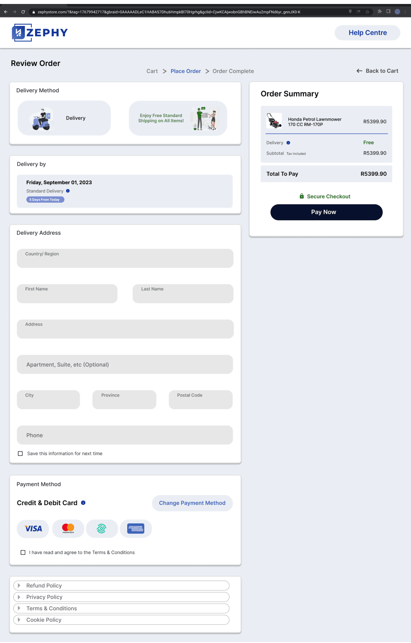
A simplified, single-page summary before payment — combining delivery method, address, and payment for mental ease.
Microcopy reinforcement:
Added soft cues like “Secure Checkout” and “Save this information for next time” to lower cognitive and emotional friction.
Project Impact
This project sharpened the way I design for ecommerce — especially in the high-ticket space. I learned that selling expensive products demands a different strategy: buyers want clarity, credibility, and a sense of security before they commit. That shift pushed me to rethink the entire funnel from the ground up.
A big takeaway was also understanding when mobile-first stops making sense. For high-value products, customers research carefully and prefer desktop. Designing desktop-first let me use more space, clearer comparison points, and stronger trust cues. The result is a buying experience that feels serious and reliable.
I also strengthened my ability to justify decisions with metrics. Every change connected directly to KPIs: conversion rate, S.E.O, checkout completion, bounce rate, and average order value. This forced me to design less for “looks” and more for business outcome.
Finally, I learned how crucial it is to move beyond template thinking. The original flow looked generic, rushed, something anyone could spin up on Shopify. The redesigned experience feels branded, intentional, and tailored for the customer.
What I Learned
Let’s Connect
Reduce Bounce Rate
Reduce Checkout Abandonment
Improve S.E.O Performance
Increase Conversion Rate
Grethan Pienaar 2026 | Designer | grethanpienaar@gmail.com
Let’s Connect
Zephy
My Role:
UI / UX Designer
Key Performance Indicators:
S.E.O Performance +32%
Zephy is an e-commerce platform focusing on Home Improvement/ DIY.
I redesigned the end-to-end shopping journey, from landing page to checkout, to improve conversion, clarity, and brand credibility.
Business Impact
Higher conversion confidence: Desktop users — responsible for the bulk of high-value orders — now experience a tailored, frictionless buying process.
Reduced cart abandonment (−25%) due to visible trust elements and clearer pricing transparency.
Improved brand perception: The interface now conveys the same level of reliability and professionalism as the products Zephy sells.
We shifted to a desktop-first design strategy prioritized clarity, trust, and product education - All of which benefit from the spatial flexibility of a desktop canvas.
Key shifts included:
The original website was built mobile-first , following a common best practice for
e-commerce design.
The mobile layout limited how much product detail, comparison data, and trust-building content could be presented effectively.
Users browsing on mobile devices often dropped off before completing a purchase, and desktop users - who made up the majority of high-value transactions - were left with an under-optimized experience.
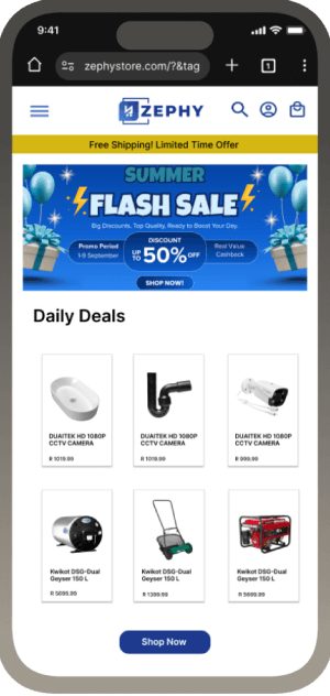
Generic layout - No brand story - High bounce rate
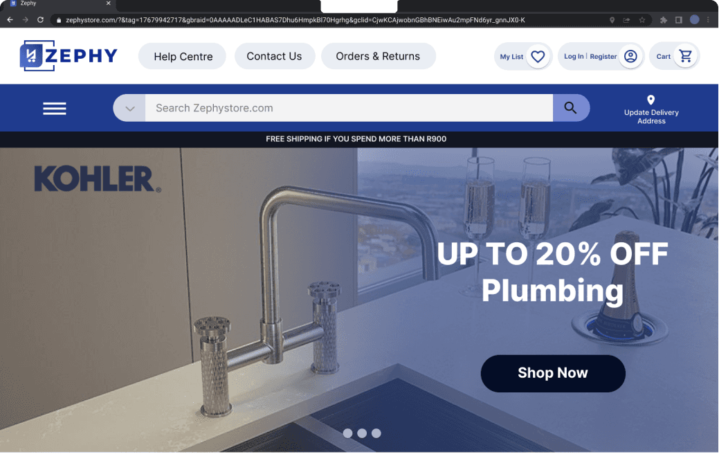
Curated navigation tiles,
Trusted Brands, Consistent spacing.
Before
Impact
After
Simplified hero with Cleaner Layout- designed for Accessibility
Original template design - Cluttered, Generic, Conversion-Poor.
Business Objectives
Problem- Solution- Impact
From Generic Listings to Value-Driven Product Experience
Simplifying the Path to Purchase
Quantifiable Outcomes
Project Impact
Understanding the Problem
Desktop First- Mobile Later


Conversions
Bounce Rate
+20%
-35%
+32%
S.E.O Performance


Template design providing little to no- Trust Signals
Visible Improvement in (trust badges, delivery info, CTA area, and more structured reviews)
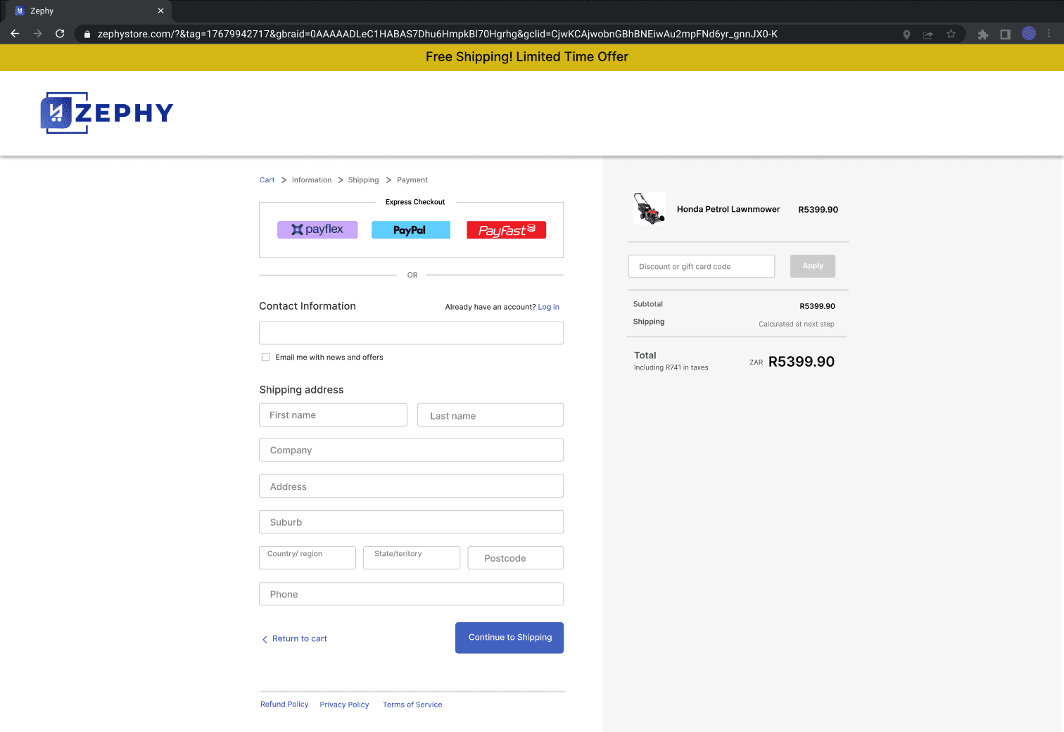
Flat, transactional tone: The page felt mechanical — not human or brand-driven — which led to hesitation in completing purchases above R5,000+.
Trust and transparency cues:
Clear delivery estimates (“5 Days From Today”), visible total price, and payment badges near the “Pay Now” button.
Progressive clarity: A simplified, single-page summary before payment — combining delivery method, address, and payment for mental ease.
Microcopy reinforcement:
Added soft cues like “Secure Checkout” and “Save this information for next time” to lower cognitive and emotional friction.
This project sharpened the way I design for ecommerce — especially in the high-ticket space. I learned that selling expensive products demands a different strategy: buyers want clarity, credibility, and a sense of security before they commit. That shift pushed me to rethink the entire funnel from the ground up.
A big takeaway was also understanding when mobile-first stops making sense. For high-value products, customers research carefully and prefer desktop. Designing desktop-first let me use more space, clearer comparison points, and stronger trust cues. The result is a buying experience that feels serious and reliable.
I also strengthened my ability to justify decisions with metrics. Every change connected directly to KPIs: conversion rate, S.E.O, checkout completion, bounce rate, and average order value. This forced me to design less for “looks” and more for business outcome.
Finally, I learned how crucial it is to move beyond template thinking. The original flow looked generic, rushed, something anyone could spin up on Shopify. The redesigned experience feels branded, intentional, and tailored for the customer.
What I Learned

Expanded content hierarchy:
Room for detailed specs, warranty info, and comparisons without overwhelming users.
Enhanced trust cues:
Clear visibility of payment options, shipping guarantees, and secure checkout messaging.
Professional-grade layouts:
Ideal for Zephy’s B2B audience (contractors, electricians, builders) who shop via laptops or workstations.
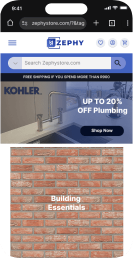
Progressive enhancement for mobile:
Mobile layouts were simplified versions of the desktop experience — still fast, still clean, but intentionally leaner for on-the-go product lookups rather than full purchase flow.


KPI
Before
Conversion Rate
1,8 %
41
70 %
14 %
73
40 %
22%
3,2%
+ 77%
+ 32%
-40 %
+ 16%
S.E.O Score
Cart Abandonment
Returning Customers
After
Delta
Improved Mobile experience:
Simplified- Clear- Fast- Clean
Lack of trust-building visuals: No security cues, delivery timelines, or policy reassurance near critical actions.
Reduce Bounce Rate
Reduce Checkout Abandonment
Improve S.E.O Performance
Increase Conversion Rate
Grethan Pienaar 2026 | Designer | grethanpienaar@gmail.com
Project Impact
This project sharpened the way I design for ecommerce — especially in the high-ticket space. I learned that selling expensive products demands a different strategy: buyers want clarity, credibility, and a sense of security before they commit. That shift pushed me to rethink the entire funnel from the ground up.
A big takeaway was also understanding when mobile-first stops making sense. For high-value products, customers research carefully and prefer desktop. Designing desktop-first let me use more space, clearer comparison points, and stronger trust cues. The result is a buying experience that feels serious and reliable.
I also strengthened my ability to justify decisions with metrics. Every change connected directly to KPIs: conversion rate, S.E.O, checkout completion, bounce rate, and average order value. This forced me to design less for “looks” and more for business outcome.
Finally, I learned how crucial it is to move beyond template thinking. The original flow looked generic, rushed, something anyone could spin up on Shopify. The redesigned experience feels branded, intentional, and tailored for the customer.
What I Learned
Zephy
My Role:
UI / UX Designer
Key Performance Indicators:
S.E.O Performance +32%
Zephy is an e-commerce platform focusing on Home Improvement/ DIY.
I redesigned the end-to-end shopping journey, from landing page to checkout, to improve conversion, clarity, and brand credibility.
Business Impact
Higher conversion confidence: Desktop users — responsible for the bulk of high-value orders — now experience a tailored, frictionless buying process.
Reduced cart abandonment (−25%) due to visible trust elements and clearer pricing transparency.
Improved brand perception: The interface now conveys the same level of reliability and professionalism as the products Zephy sells.
We shifted to a desktop-first design strategy prioritized clarity, trust, and product education - All of which benefit from the spatial flexibility of a desktop canvas.
Key shifts included:
The original website was built mobile-first , following a common best practice for
e-commerce design.
The mobile layout limited how much product detail, comparison data, and trust-building content could be presented effectively.
Users browsing on mobile devices often dropped off before completing a purchase, and desktop users - who made up the majority of high-value transactions - were left with an under-optimized experience.
Generic layout - No brand story - High bounce rate
Curated navigation tiles,
Trusted Brands, Consistent spacing.
Before
Before
Before
Impact
After
After
After
Simplified hero with Cleaner Layout- designed for Accessibility
Original template design - Cluttered, Generic, Conversion-Poor.
Business Objectives
Problem- Solution- Impact
From Generic Listings to Value-Driven Product Experience
Simplifying the Path to Purchase
Quantifiable Outcomes
Understanding the Problem
Desktop First- Mobile Later


Conversions
Bounce Rate
+20%
-35%
+32%
S.E.O Performance

Template design providing little to no- Trust Signals
Visible Improvement in (trust badges, delivery info, CTA area, and more structured reviews)
Flat, transactional tone: The page felt mechanical — not human or brand-driven — which led to hesitation in completing purchases above R5,000+.
Trust and transparency cues: Clear delivery estimates (“5 Days From Today”), visible total price, and payment badges near the “Pay Now” button.
Progressive clarity: A simplified, single-page summary before payment — combining delivery method, address, and payment for mental ease.
Microcopy reinforcement: Added soft cues like “Secure Checkout” and “Save this information for next time” to lower cognitive and emotional friction.

Expanded content hierarchy:
Room for detailed specs, warranty info, and comparisons without overwhelming users.
Enhanced trust cues:
Clear visibility of payment options, shipping guarantees, and secure checkout messaging.
Professional-grade layouts:
Ideal for Zephy’s B2B audience (contractors, electricians, builders) who shop via laptops or workstations.
Progressive enhancement for mobile:
Mobile layouts were simplified versions of the desktop experience — still fast, still clean, but intentionally leaner for on-the-go product lookups rather than full purchase flow.


KPI
Before
Conversion Rate
1,8 %
41
70 %
14 %
73
40 %
22%
3,2%
+ 77%
+ 32%
-40 %
+ 16%
S.E.O Score
Cart Abandonment
Returning Customers
After
Delta
Improved Mobile experience:
Simplified- Clear- Fast- Clean
Lack of trust-building visuals: No security cues, delivery timelines, or policy reassurance near critical actions.
Let’s Connect
Reduce Bounce Rate
Reduce Checkout Abandonment
Improve S.E.O Performance
Increase Conversion Rate
Grethan Pienaar 2026 | Designer | grethanpienaar@gmail.com